Difference between revisions of "P5JS look like an mobil app"
From Digipool-Wiki
(Created page with " Use this code for '''Index.html''' <pre> <html> <head> <meta charset="UTF-8"> <script language="javascript" type="text/javascript" src="libraries/p5.js"></script> <!-...") |
|||
| (7 intermediate revisions by the same user not shown) | |||
| Line 1: | Line 1: | ||
| + | [[File:Phone.png|100px|right]] | ||
| + | |||
| + | '''To make p5*js look like an app''', there are three issues. | ||
| + | # How do I recognize a mobile device? | ||
| + | # How do I activate the full-screen view? | ||
| + | # How do I simulate the phone on the desktop computer? | ||
| + | |||
| + | This tutorial shows P5JS Sketches on a mobile device in full screen portrait mode and on the desktop computer in landscape mode the canves is displayed inside a mobile phone frame. Because the deviceOrientation command does not work reliable to detect a mobile devices, this tutorial will look at the height and width ratio. | ||
| + | |||
| + | Applications in landscape mode must reverse these conditions. | ||
| + | |||
| + | <br> | ||
| + | |||
| + | == Phone Frame == | ||
| + | |||
| + | Place this PNG file in your folder - [[Media:Phone.png|LINK]] | ||
| + | |||
| + | <br> | ||
| + | |||
| + | == HTML File == | ||
Use this code for '''Index.html''' | Use this code for '''Index.html''' | ||
| Line 37: | Line 57: | ||
</pre> | </pre> | ||
| + | |||
| + | <br> | ||
| + | |||
| + | == Sketch == | ||
| + | |||
| + | <pre> | ||
| + | |||
| + | function windowResized() { | ||
| + | // keep a 16:9 portrait format | ||
| + | if(windowWidth<windowHeight){ | ||
| + | resizeCanvas(windowWidth,windowHeight); | ||
| + | } else { | ||
| + | resizeCanvas( (windowHeight/1.3)*0.5625, windowHeight/1.38); | ||
| + | } | ||
| + | } | ||
| + | |||
| + | function setup() { | ||
| + | // keep a 16:9 portrait format | ||
| + | if(windowWidth<windowHeight){ | ||
| + | createCanvas(windowWidth,windowHeight); | ||
| + | } else { | ||
| + | createCanvas( (windowHeight/1.3)*0.5625, windowHeight/1.38); | ||
| + | } | ||
| + | } | ||
| + | |||
| + | </pre> | ||
| + | |||
| + | <br> | ||
| + | |||
| + | |||
| + | == Workflow and further tutorials == | ||
| + | |||
| + | [https://creative-coding.decontextualize.com/mobile/ Making your sketches work on mobile devices] | ||
| + | |||
| + | <br> | ||
Latest revision as of 00:16, 29 November 2017

To make p5*js look like an app, there are three issues.
- How do I recognize a mobile device?
- How do I activate the full-screen view?
- How do I simulate the phone on the desktop computer?
This tutorial shows P5JS Sketches on a mobile device in full screen portrait mode and on the desktop computer in landscape mode the canves is displayed inside a mobile phone frame. Because the deviceOrientation command does not work reliable to detect a mobile devices, this tutorial will look at the height and width ratio.
Applications in landscape mode must reverse these conditions.
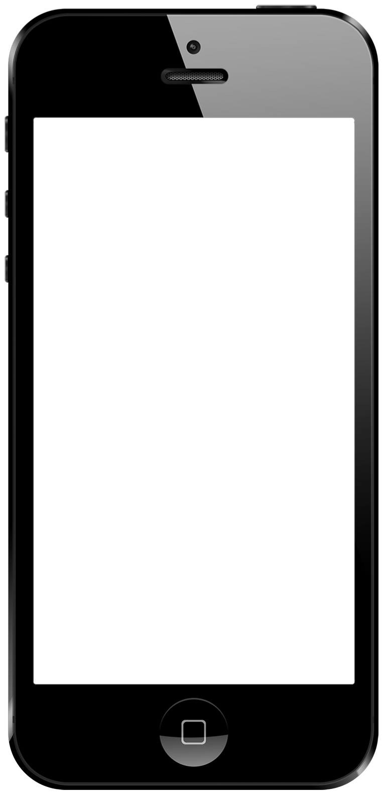
Phone Frame
Place this PNG file in your folder - LINK
HTML File
Use this code for Index.html
<html>
<head>
  <meta charset="UTF-8">
  <script language="javascript" type="text/javascript" src="libraries/p5.js"></script>
  <!-- uncomment lines below to include extra p5 libraries -->
  <!--<script language="javascript" src="libraries/p5.dom.js"></script>-->
  <!--<script language="javascript" src="libraries/p5.sound.js"></script>-->
  <script language="javascript" type="text/javascript" src="sketch.js"></script>
  <!-- this line removes any default padding and style. you might only need one of these values set. -->
  <style> body {
  	padding: 0;
  	margin: 0;
  	display: flex;

	  /* This centers our sketch horizontally. */
	  justify-content: center;

	  /* This centers our sketch vertically. */
	  align-items: center;

    background-image:url(phone.png);
    background-repeat:no-repeat;
    background-position:50% 50%;
    background-size: auto 100%;
  	} </style>
  <meta name="viewport" content="user-scalable=no,initial-scale=1,maximum-scale=1,minimum-scale=1,width=device-width">
</head>

<body>
</body>
</html>
Sketch
function windowResized() {
	// keep a 16:9 portrait format
	if(windowWidth<windowHeight){
		resizeCanvas(windowWidth,windowHeight);
	} else {
		resizeCanvas( (windowHeight/1.3)*0.5625, windowHeight/1.38);
	}
}

function setup() {
	// keep a 16:9 portrait format
	if(windowWidth<windowHeight){
		createCanvas(windowWidth,windowHeight);
	} else {
		createCanvas( (windowHeight/1.3)*0.5625, windowHeight/1.38);
	}
}
Workflow and further tutorials
Making your sketches work on mobile devices